It’s been a while since I’ve blogged and that’s because it’s been a fairly hectic few months! Last month I moved about an hour down the road from Evesham, Worcestershire to Banbury, Oxfordshire! Moving, as always was pretty stressful, but things are finally getting back to normal and I’ve made some amazing connections here already… As I was feeling a little ‘creatively stuck’ in the weeks leading up to the move, I gave myself a little bit of time off from personal work so as soon as I’d settled in my new studio I sat down I had a good hard look at my portfolio (and a chat with my agent!). The thing that stuck out the most was that I was missing ‘work in context’, I had lots of different types of illustrations but nothing showing how they could be used by commissioners… So I decided to work on an illustrated packaging project, which is something I’ve always wanted to be hired for, and combined my love of typography, layouts and illustration. They say you should always put out what you want to get back, so here’s my call out to the universe!!
My favourite thing in the whole entire world is peppermint tea so it was a pretty easy choice and it gave my an excuse to illustrate some vintage teaware… I wanted to create something that was fresh and vibrant whilst being luxurious and classy. Something that stood out on the shelves but you could also look at more closely to see interesting details.
Below are my initial sketches for the project… I use my iPad for sketching these days as it allows me to quickly get ideas down. Procreate is a great iPad program which allows you to sketch, add colour to and change the size/scale of elements effortlessly which means you can work through lots of possibilities in no time at all.
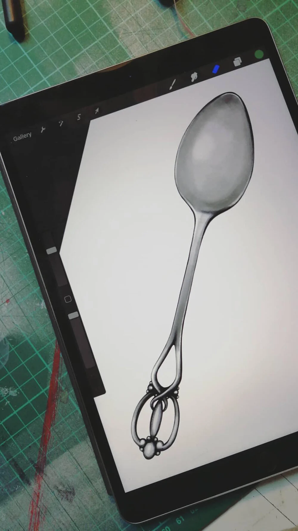
Once I had roughly worked out the layout I began drawing up the different elements, starting with the teapot and teacup. I had lots of fun researching vintage teaware and creating a set which combined different bits of all the ones I liked the most! I then moved on to sketching out some peppermint leaves…
The next step involved digitally colouring and editing my sketches and creating a leaf pattern from my leaf sketches. As with most of my illustrations, I start in Adobe Photoshop before moving them into Procreate on my iPad for final touches… The leaf pattern was created in Adobe Illustrator as it allows you to create seamless patterns.
As you can see from my sketches, my original plan was actually to mock these designs up on a box rather than a tin, however as the project evolved I decided to change this. Below you can see two of my initial ideas for the front face of the box, involving peppermint tea leaves being poured from the teapot… Although these work as stand alone illustrations, when they were mocked up on the box they didn’t work. The first one looked way too busy and the second was too ‘green’ without the leaves in the background. Also, it didn’t seem to flow so well on a rectangular box I decided to change the design to work on a circular tin instead… This was one of the main things I learnt during this little project, that just because something works on it’s own, doesn’t mean its necessarily going to look good on packaging.
For the peppermint typography I started by sketching out my ideas on my iPad before taking a final drawing into Adobe Illustrator and refining the curves.
Finally, I worked to bring all the elements together, along with the logo and barcode to create a seamless design that could be wrapped around a tin. I used a free mock up template from GraphicBurger to show how my design would work on packaging. It was lovely to be able to bring my designs to life using a mock up template, so I will definitely be trying it out again!


